Designers in Britain - 1947


Advertising posters

Some things don't change after 60 years; posters advertising the benefits of eating vegetables daily for good health, and a current topic about growing your own food rather than shipping in overseas produce.
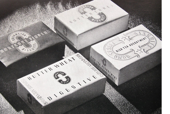

Packaging design - I love the stylish simplicity of the graphics used for the butter and biscuit packaging (no nasty product images, primary colours or gimmicky advertising slogans!)
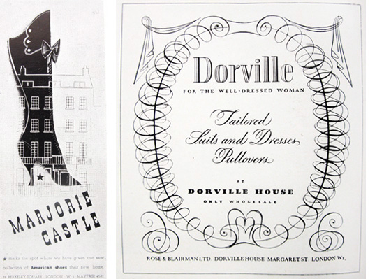
Beautiful script, fonts and embellishments used in these advertisements for women's shoes and apparel shops 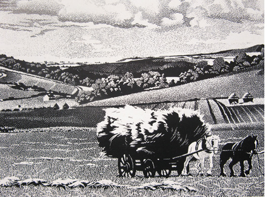

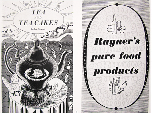

Decorative fonts
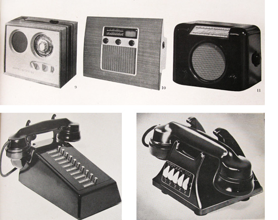
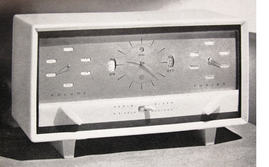
Fabulous examples of current domestic furniture!
This first book showcases the commercial and industrial design from post-war Britain in 1947 and is divided into themes covering posters, advertising and the media, book illustration and cover jackets, packaging, illustration for publicity, lettering and domestic furniture etc. It's fascinating to look at the designs and graphic arts from this period - not only for the style of the designs and illustrations, but also what was being advertised and publicised at this particular time.
I'm also captivated by the hand-drawn aesthetic across all sectors of design. This was a time before the use of digital photography and desk-top publishing, so pretty much everything was created by hand from scratch. The majority of posters and advertising material, book jackets and illustrations were all created as hand-drawn artworks. No CAD technology or digital equipment to speed up the process - but painstakingly created with pen and ink. However, far from being naive or simplistic, I think the designs created in this style are beautifully decorative and often quite sophisticated in comparison to some of today's commercial design.